Tips for Choosing Calm Colors to Create a Relaxing Home
gekekaa.pro >> Home Decor>>Interior Design>> Tips for Choosing Calm Colors to Create a Relaxing Home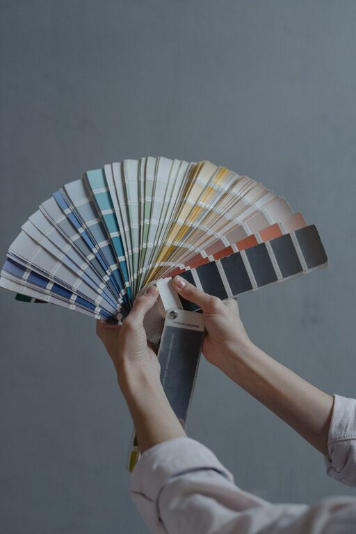
Tips for Choosing Calm Colors to Create a Relaxing Home
Creating a calm and peaceful atmosphere in your home starts with choosing the right colors. Colors have a powerful effect on our mood and energy. The hues surrounding us can either energize or soothe, so selecting calm colors can help transform your space into a relaxing sanctuary.
In this post, you’ll find practical tips for choosing calm colors for your walls, furniture, and decor. Whether you’re painting a single room or redesigning your entire home, these ideas will guide you toward a serene and inviting environment.
Why Choose Calm Colors?
Calm colors typically include soft, muted tones that encourage relaxation and reduce stress. These colors can make a room feel more spacious, airy, and comfortable. Using calm colors is especially beneficial in areas where you unwind, such as bedrooms, living rooms, and reading nooks.
Some benefits of calm colors in your home:
– Encourages restful sleep
– Reduces feelings of anxiety
– Creates a peaceful ambiance
– Complements natural light to enhance brightness
Understanding Color Psychology
Before picking your colors, it helps to understand how different hues affect feelings:
– Blues: Known for their calming effect, blues remind us of the sky and water. Soft blues promote tranquility and focus.
– Greens: Green symbolizes nature and balance. It can create a refreshing and restful vibe.
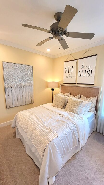
– Neutrals: Shades like beige, taupe, and warm grays offer a timeless, soothing backdrop without overwhelming the senses.
– Lavender and soft purples: These gentle colors can feel peaceful and slightly luxurious.
– Pale pinks: Soft pinks add warmth and tenderness without being intense.
Avoid overly bright or neon colors in calm spaces as they can be stimulating or tiring.
Tips for Choosing Calm Colors for Your Home
1. Consider Natural Light
The amount and quality of natural light influence how colors appear. For rooms with plenty of sunlight, you can explore cooler tones like pale blue or soft green. In darker rooms, warmer neutrals or muted pastels help keep the space feeling cozy and inviting.
2. Start with a Neutral Base
Neutral colors are a safe and flexible foundation. Painting walls in shades of off-white, cream, or soft gray lets you add pops of calming color through furniture, textiles, or artwork. This approach is easy to update over time without a full repaint.
3. Use Color Samples
Always test paint colors on your walls before committing. Paint large swatches and observe them at different times of day. Natural and artificial lighting can change the way colors look, so make sure the calm tones you choose maintain their soothing quality throughout the day.
4. Limit the Number of Colors
Keeping your palette simple—two or three calm colors per room—helps create harmony and avoids visual clutter. You can combine a main wall color with complementary shades on trims and furnishings for subtle contrast.
5. Incorporate Texture and Layers
Calm colors don’t have to be flat or boring. Use textured fabrics, soft rugs, and natural materials like wood or stone to add interest. Layering different textures in a similar color family enhances the calming effect.
6. Think About Room Function
Choose colors that align with how you use each room. Soft blues and greens work well in bedrooms to aid relaxation. Warm neutrals are great for living spaces where people gather. Even calm colors in kitchens and bathrooms can make these spaces feel fresh and inviting.
7. Balance Warm and Cool Tones
While cool tones tend to be more calming, mixing warm and cool tones creates a balanced environment. For example, a soft gray-blue wall paired with warm beige furniture can feel both restful and welcoming.
Examples of Calm Color Palettes
Here are a few color combinations that commonly evoke calmness:
– Soft Blue + Warm White + Light Gray
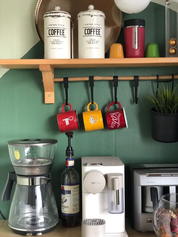
– Sage Green + Cream + Natural Wood
– Lavender + Pale Pink + Ivory
– Beige + Taupe + Dusty Rose
– Pale Aqua + Soft Sand + Cool Gray
Feel free to customize these palettes based on your preferences and lighting conditions.
Final Thoughts
Choosing calm colors for your home is a wonderful way to invite tranquility into your everyday life. By understanding how colors affect mood and following practical tips, you can design spaces that feel restful and beautiful.
Remember to test your colors, consider the lighting, and keep your palettes simple and cohesive. With the right calm colors, your home will become a true haven—a place to relax, recharge, and enjoy peaceful moments.
—
We hope these tips inspire you to create a serene color scheme that fits your style and space. Happy decorating!
Related Post